
Dataphors: Definition, Principles and Examples
What Are Dataphors?
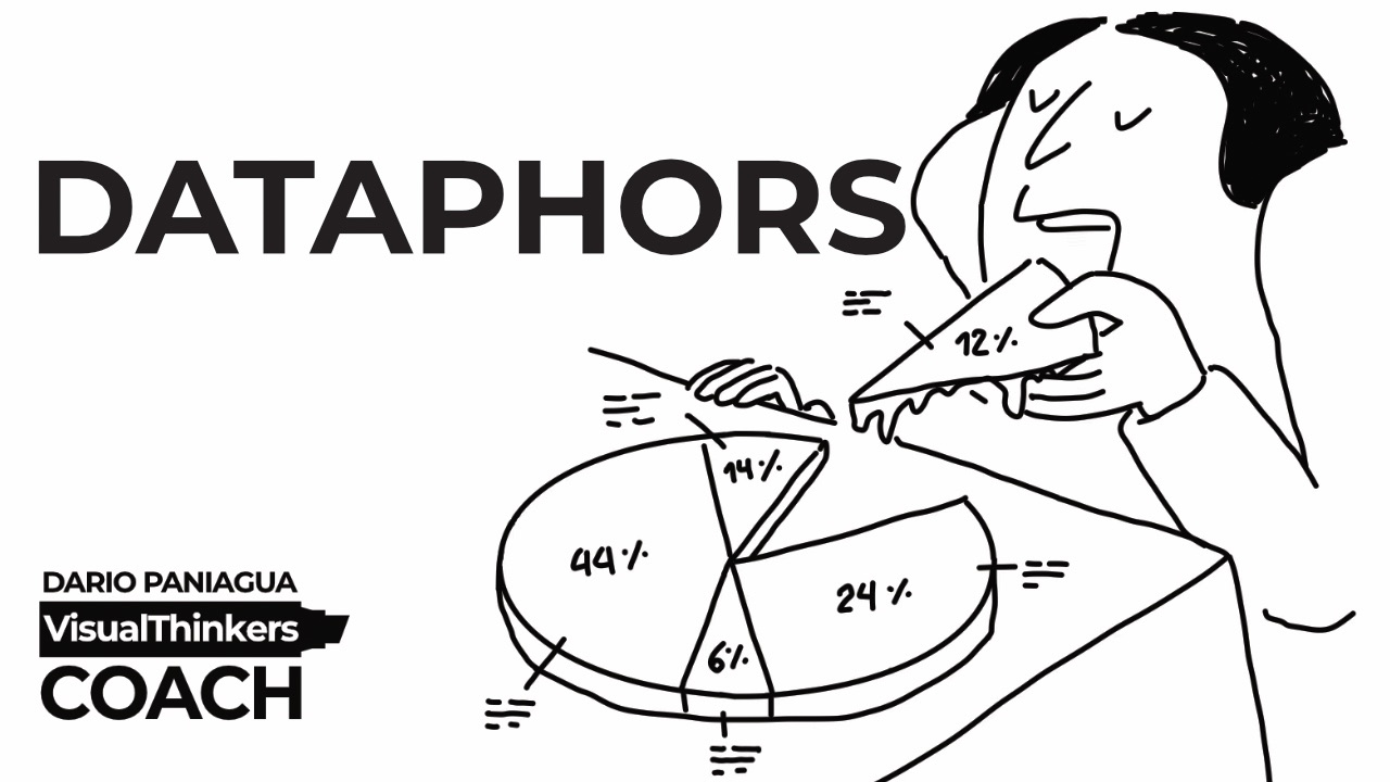
Dataphors are visual metaphors applied to data visualizations.
The word Dataphors is a term I coined by combining the words Data and Metaphors.
A Dataphor transforms a chart into a visual narrative by dressing data with meaningful illustrations. Instead of showing numbers alone, a Dataphor adds visual elements that provide context, emotion, symbolism, or story while preserving the integrity of the data.
A Dataphor is not simply a chart illustration. It is a method for combining data visualization and visual metaphor to communicate insight more effectively.
The goal is not decoration.
The goal is understanding.
A Dataphor helps people see what the data means, not just what the data says.
Who Created the Concept of Dataphors?
I introduced the concept of Dataphors as an evolution of the ideas explored in my book Visual Metaphors Bible.
After years of studying how metaphors help communicate ideas, I started exploring a simple question:
What if charts could use visual metaphors without sacrificing data accuracy?
That question led to the creation of Dataphors.
This article serves as the original public definition and documentation of the Dataphor framework.
The Core Principle
A Dataphor must never distort the data.
Beauty cannot prevail over information.
The data must remain accurate, readable, and trustworthy.
A visual metaphor should strengthen the message of the chart, not compete with it.
If the illustration becomes more important than the numbers, the Dataphor has failed.
The metaphor serves the data.
Never the other way around.
Aesthetic Dataphors vs Real Dataphors
Not all visual enhancements are Dataphors in the same way.
Aesthetic Dataphors

These use illustrations primarily for decoration.
They may make a chart more attractive, but they do not significantly improve understanding of the data.
Their contribution is visual rather than explanatory.
Real Dataphors
These use metaphor intentionally.
The illustration helps explain the data, reveal relationships, communicate meaning, or reinforce a narrative.
The visual element becomes part of the communication process.
It is not decoration.
It is interpretation.
This distinction is important because many data visualizations look creative but do not actually help people understand the story behind the data.
Real Dataphors do.
Three Ways to Apply Dataphors
Depending on the story you want to tell, a Dataphor can appear before, within, or after a chart.
1. Before the Chart

Use the illustration to establish context.
The illustration appears before the viewer reads the data.
It prepares the audience for what they are about to see and creates a meaningful framework for interpretation.
Think of it as the opening scene of a story.
The data comes next.
2. Within the Chart

The metaphor becomes part of the visualization itself.
Illustrations interact directly with the data and help explain what the numbers represent.
This is often the most challenging approach because the visual elements must coexist with the data without reducing clarity.
The data remains the protagonist.
The metaphor acts as a supporting character.
3. After the Chart

The illustration appears after the data.
Its role is to emphasize consequences, insights, or conclusions.
Think of it as the final scene of the story.
The viewer has already seen the numbers.
The metaphor helps them remember the meaning.
When the Entire Chart Becomes the Metaphor

Sometimes the metaphor can go beyond individual illustrations.
In some cases, the entire visualization can become the metaphor.
The scenario itself becomes the chart.
The chart becomes the scenario.
The data structure and the visual narrative merge into a single experience.
This is the most advanced form of Dataphor design because every element contributes simultaneously to accuracy and storytelling.
Why Dataphors Matter
We live in a world flooded with data.
The problem is rarely access to information.
The problem is understanding.
Most charts communicate values.
Few communicate meaning.
Dataphors bridge that gap.
They combine the analytical power of data visualization with the emotional and cognitive power of visual metaphors.
The result is a chart that informs and communicates at the same time.
A Simple Definition
Dataphors are visual metaphors integrated into data visualizations to add meaning, context, and storytelling without altering the underlying data.
In just one sentence: how data is visualized using metaphors.
Frequently Asked Questions
What is a Dataphor?
A Dataphor is a visual metaphor integrated into a data visualization to add meaning, context, and storytelling without changing the underlying data.
Who coined the term Dataphors?
The term Dataphors was coined by Dario Paniagua as part of his research into visual metaphors, storytelling, and data visualization.
How are Dataphors different from data visualization?
Traditional data visualization focuses on presenting information clearly and accurately. Dataphors add metaphorical elements that help communicate meaning, context, and narrative while preserving data accuracy.
Can Dataphors be used in any chart?
Dataphors can be applied before, within, or after a chart, depending on the story being told and the level of visual integration required.
However, some chart types offer more opportunities for metaphorical integration than others.
Charts such as column charts, bar charts, line charts, pie charts, and gauge charts are generally Dataphor-friendly because their structure leaves room for visual elements without compromising readability.
Other chart types, such as heat maps, area charts, funnel charts, or radar charts, can be more challenging because the metaphor must coexist with the visual structure of the data without reducing clarity.
In principle, Dataphors can be used with any type of chart. The challenge is not whether a metaphor can be added, but whether it can be added without weakening the communication of the data.
Do Dataphors change the data?
It depends on the type of Dataphor you are creating.
If you are dressing real data, the underlying data must remain accurate and trustworthy.
The metaphor can add meaning, context, emotion, symbolism, or visual appeal, but it should never change the values represented by the data.
In this case, the metaphor helps explain and reinforce the meaning of the data.
In Aesthetic Dataphors, the contribution may be more focused on visual expression, atmosphere, or storytelling.
The goal is not necessarily to explain the data better, but to make the visualization more engaging, memorable, or emotionally resonant.
Looking Ahead
This article is the first step in documenting the Dataphor framework.
In the coming months, I will publish additional examples, principles, techniques, and case studies as part of my ongoing research and my upcoming book dedicated entirely to Dataphors.
The field of data visualization has focused for decades on clarity and accuracy.
Dataphors add another dimension:
Meaning and storytelling.
Because people do not remember numbers.
They remember stories.
Dario Paniagua coined the term Dataphors as an extension of his research on visual metaphors, visual storytelling, and data visualization.
