Sometimes, the concept you need to communicate needs a comparison.
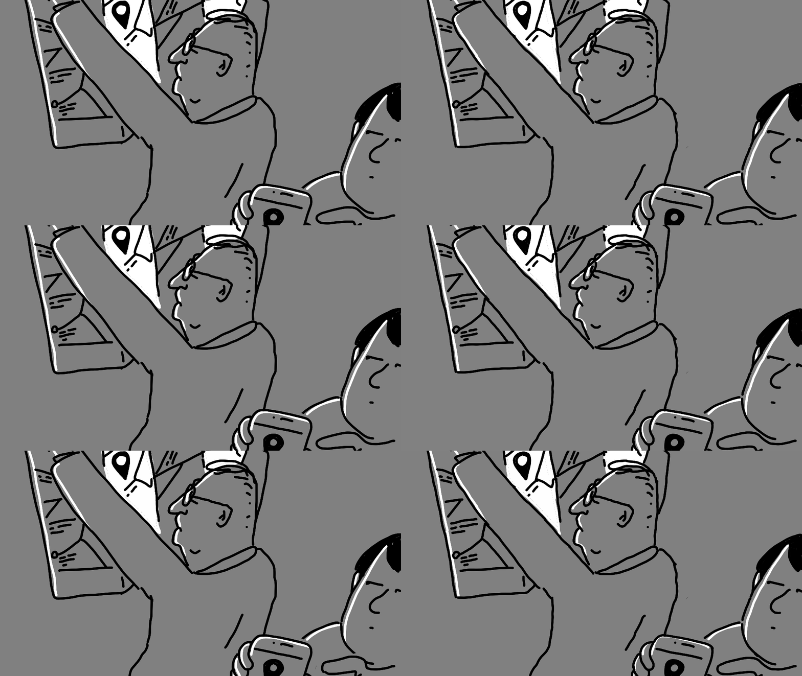
A paper map is just a paper map.
But put it next to a smartphone with Google Maps…
Suddenly, the paper map becomes a relic.
When we compare two things, we automatically create a hierarchy between them.
We start seeing one as old and the other as new.
One as slow and the other as fast.
One as obsolete and the other as current.
But we don’t necessarily see these relationships when we look at each object on its own.
The comparison can be very simple:
One object next to another.
Or you can create a whole story around the comparison.
But remember: The more details you add to a scene, the longer it takes to decode.
So always ask yourself:
How much time will my audience have to look at this?
And design your visual accordingly.
If you want to learn more about visual metaphors and use them to strengthen your creativity, my Visual Thinking membership is open.
Use INK2026 for the special October discount.
Even when you are drawing a simple, tangible object, try to tell a story.
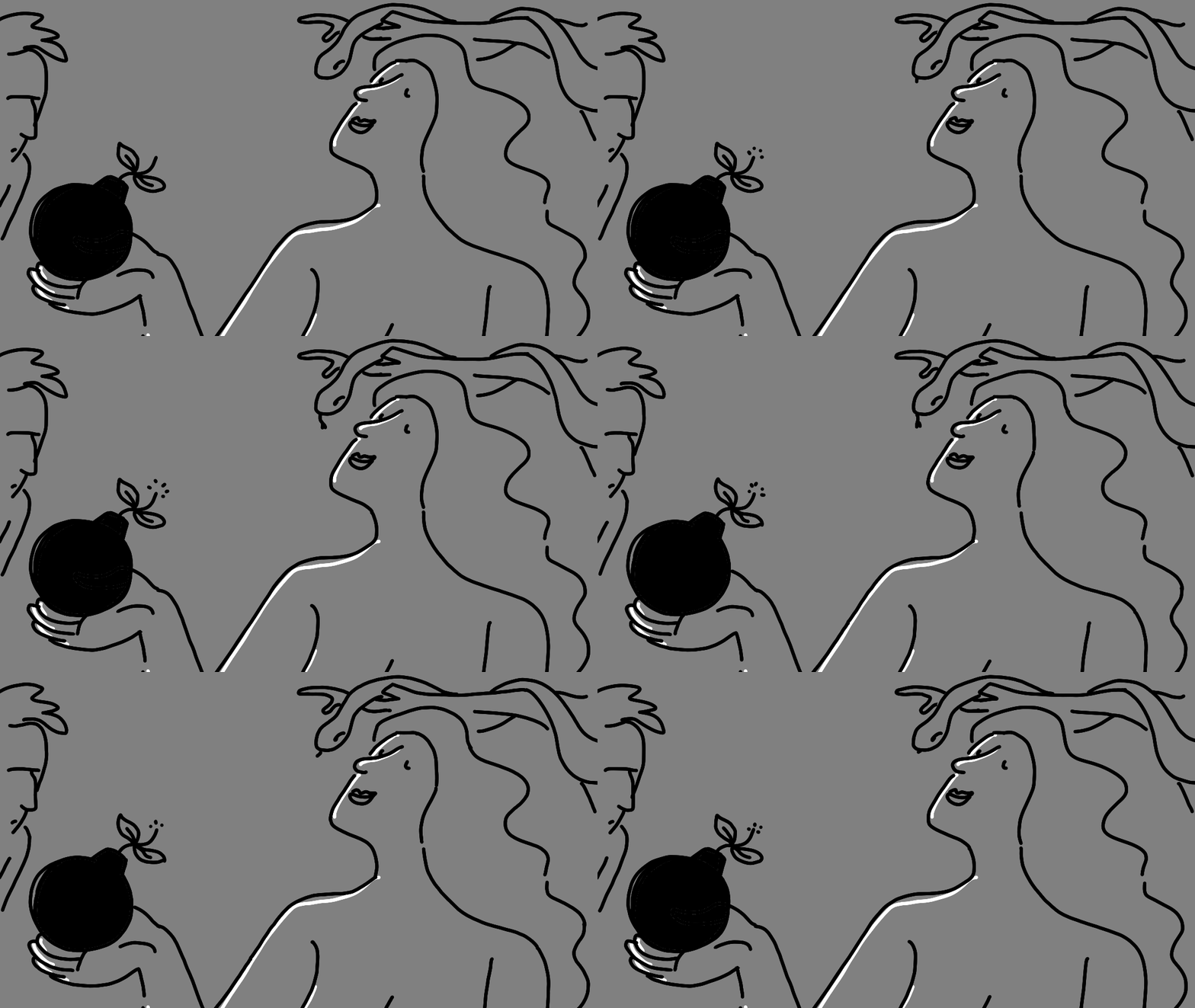
The story can be very short. Or it can be more complex. But I believe there should always be a story and something disruptive that makes us stop.
What makes a story longer or shorter?
The number of elements you add around your main concept.
I could have simply drawn an apple. Or an apple + a bomb.
But when I add other elements that give the image context, the story becomes richer.
And now, the person looking at it needs a little more time to decode what is happening.
So, the story can be short or long. But disruption always helps.
When we see something that feels out of place, our brain wants to understand why it is there.
And that small moment of confusion can make someone stop and look a little longer.
So here is my first Inktober tip:
If you want people to spend more time looking at your image, give them something to figure out.
More tips coming
Dataphors: Definition, Principles and Examples
What Are Dataphors?
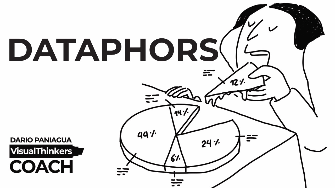
Dataphors are visual metaphors applied to data visualizations.
The word Dataphors is a term I coined by combining the words Data and Metaphors.
A Dataphor transforms a chart into a visual narrative by dressing data with meaningful illustrations. Instead of showing numbers alone, a Dataphor adds visual elements that provide context, emotion, symbolism, or story while preserving the integrity of the data.
A Dataphor is not simply a chart illustration. It is a method for combining data visualization and visual metaphor to communicate insight more effectively.
The goal is not decoration.
The goal is understanding.
A Dataphor helps people see what the data means, not just what the data says.
Who Created the Concept of Dataphors?
I introduced the concept of Dataphors as an evolution of the ideas explored in my book Visual Metaphors Bible.
After years of studying how metaphors help communicate ideas, I started exploring a simple question:
What if charts could us...
Creativity Begins with Unexpected Connections
School rewarded us for finding the expected answer.
Creativity rewards us for finding the unexpected connection.
Think about a math exam.
Everyone is trying to arrive at the same answer.
Now think about creating an illustration.
Or writing a story.
Or designing a workshop.
Or explaining a complex idea.
Suddenly, the most interesting solution is often the one nobody else thought about.
It's about connecting things that don't usually belong together.
The more unexpected the connection...
The more memorable the idea.
School didn't teach me this:
Sometimes the best answer is the one nobody expected.
What's the most unexpected connection you've ever made?
Thank you
Dario Paniagua
Visual Thinkers Coach
Predictability Is One of the Biggest Creativity Killers
One of the biggest creativity killers is not fear.
It's predictability.
Most people don't struggle because they have no ideas.
They struggle because they keep generating the same kind of ideas.
The safe ideas.
The familiar ideas.
The ideas that make sense immediately.
The problem?
Everyone else is doing exactly the same thing.
When I create visual metaphors, I often ask myself:
"What would be the most predictable solution?"
Then I deliberately move away from it.
Not because predictable ideas are wrong.
But because they are usually crowded.
School taught me to stay close to the expected answer.
Creativity rewards people who are willing to leave it behind.
School didn't teach me this:
Predictability feels comfortable.
Originality rarely does.
What's the most overused visual metaphor in your industry?
Thank you
Dario Paniagua
Visual Thinkers Coach
Don't Kill the Absurd Idea Too Soon
One thing school accidentally teaches us is that absurd ideas are bad ideas.
When you're a child, that's not how you think.
A fish can fly.
A tree can grow upside down.
A cloud can have a door.
Nobody cares if it makes sense.
Then we grow up.
And little by little, we start filtering our ideas before they even have a chance to develop.
The funny thing is that many creative ideas begin exactly this way.
They begin as something absurd.
Something that doesn't make sense yet.
Something that feels slightly ridiculous.
The problem isn't that we don't have creative ideas.
The problem is that we often reject them too early.
So here's a small challenge for yourself:
The next time you have an absurd idea...
Don't kill it immediately.
Stay with it for a few minutes.
See where it takes you.
You might be surprised.
Thank you!
Dario Paniagua
Visual Thinkers Coach
Originality Begins Where Correctness Ends
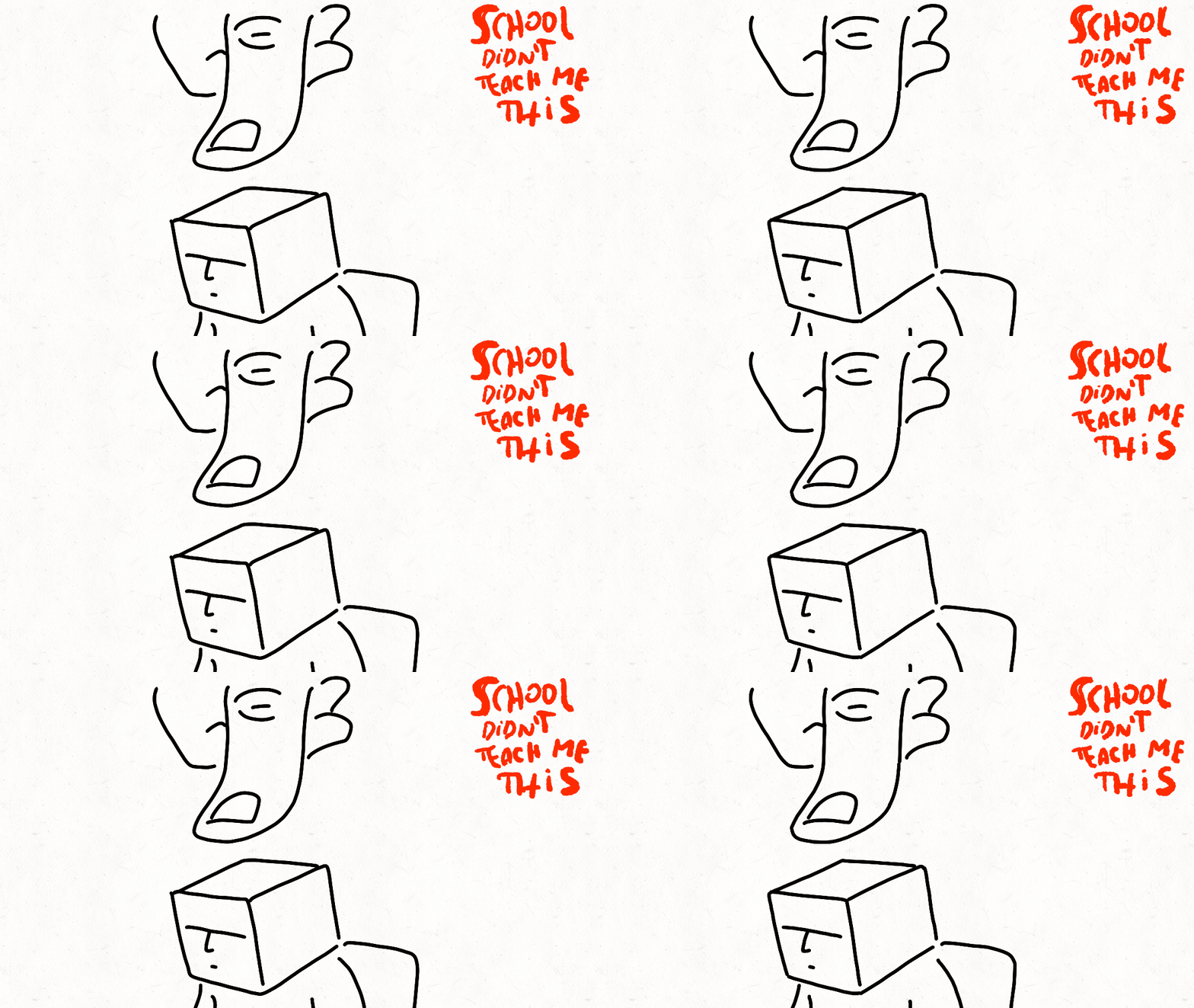
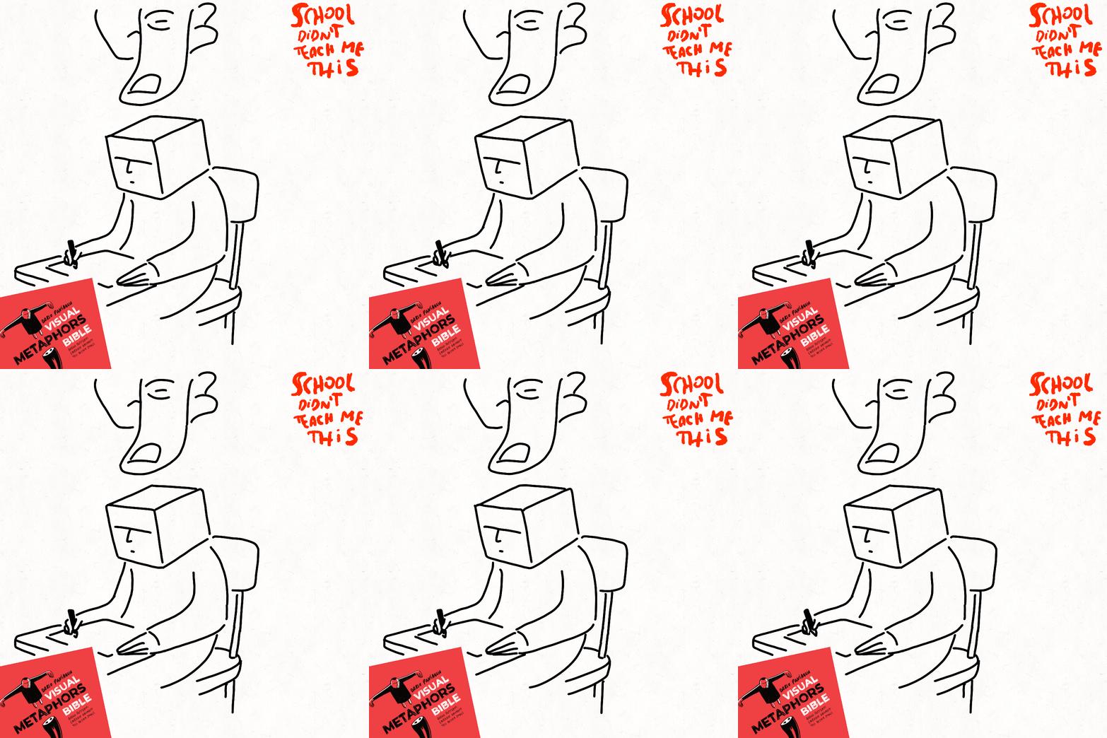
School taught me to look for the right answer.
Creativity starts when you stop looking for it.
Think about most school exams.
The goal is simple:
Find the correct answer as quickly as possible.
Now think about creating something original.
A visual metaphor.
A story.
An illustration.
A new workshop.
A business idea.
Suddenly, searching for the "correct" answer becomes a problem.
Because originality rarely arrives looking correct.
In fact, the first interesting idea is often the one that feels strange, uncomfortable, or slightly ridiculous.
Many people tell me:
"I can't come up with original ideas."
What I usually see is something different.
They come up with unusual ideas.
Then reject them too quickly.
Not because they are bad.
Because they don't look right.
School didn't teach me this:
The fastest way to find an original idea is often to stop searching for the correct one.
Thank you
Dario Paniagua
Visual Thinkers Coach
The Permission to Be Absurd
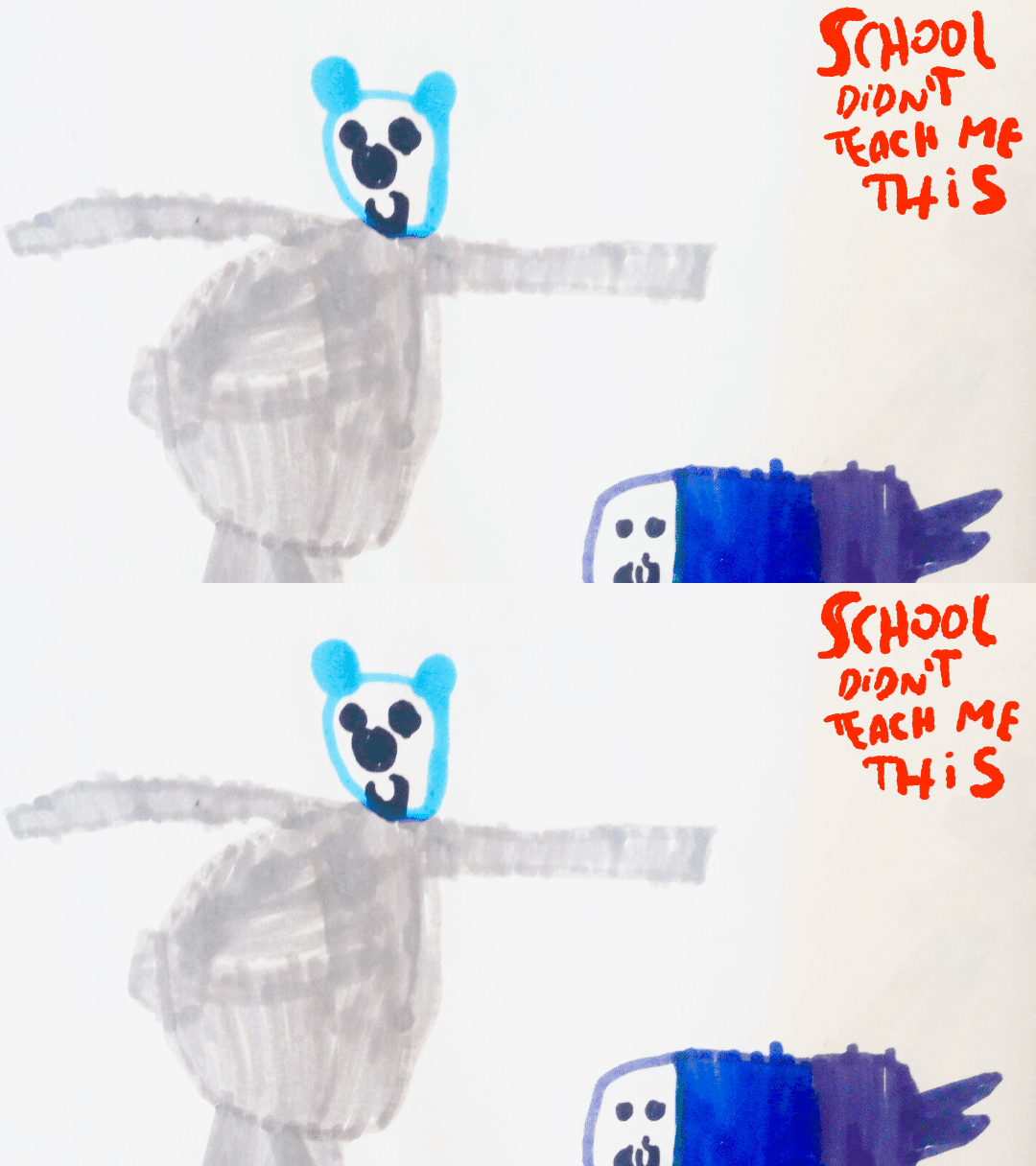
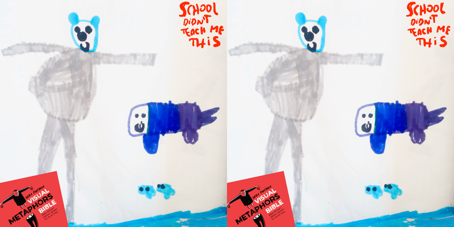
When children draw a fish flying through the sky, nobody asks:
"Does that make sense?"
They simply keep drawing.
Then school arrives.
Suddenly there are correct answers.
Correct methods.
Correct interpretations.
Correct conclusions.
Little by little, absurd ideas become mistakes.
The problem is that many creative breakthroughs begin with something that makes no sense.
A fish flying.
A humanized bear.
A door in the middle of a cloud.
A mountain inside a coffee cup.
At first, they look ridiculous.
Then they become interesting.
Then they become original.
One of the biggest obstacles I see when teaching visual metaphors isn't drawing skill.
It's permission.
Permission to create something absurd before knowing where it will lead.
School didn't teach me this:
Absurdity is not the enemy of creativity.
It is the starting point.
Dario Paniagua
Visual Thinkers Coach
What Is a Visual Metaphor (and How to Create One That Really Works)
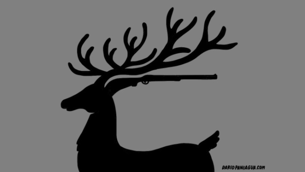
In visual thinking, a metaphor is more than decoration. It’s a bridge between abstract ideas and concrete images, a way to help people see meaning instead of just reading or hearing it. When done well, a visual metaphor transforms a complex concept into an image that feels both intuitive and surprising.
But what exactly makes a metaphor visual, and how can you create one that actually works?
Icon vs. Metaphor: What’s the Real Difference?
An icon shows what something is. A metaphor shows what something means.
If you draw a light bulb to represent an idea, that’s an icon. It refers directly to a known symbol. But if you draw an elephant whose trunk forms the shape of a lightbulb, you're not just talking about "ideas" anymore. You are adding layers of meaning and weaving a story around it.
This doesn’t mean icons don’t work. It’s just better to use icons for explanations and metaphors for stories.
And remember: it’s better to have a story to look through life than an explanatio...
Out-of-Context Technique: Iceberg and Heart Substitution in Visual Metaphors

Remember, a quick way to apply the out-of-context technique is through substitution.
You remove one element and replace it with another that seems unrelated, but a connection is established.
In this case, the iceberg resembles the shape of a heart.When you place things out of context through substitution, the replaced element gains new meaning.
Here, the heart is no longer just an organ, it becomes a trait of the person’s personality.