
Sometimes, the concept you need to communicate needs a comparison.
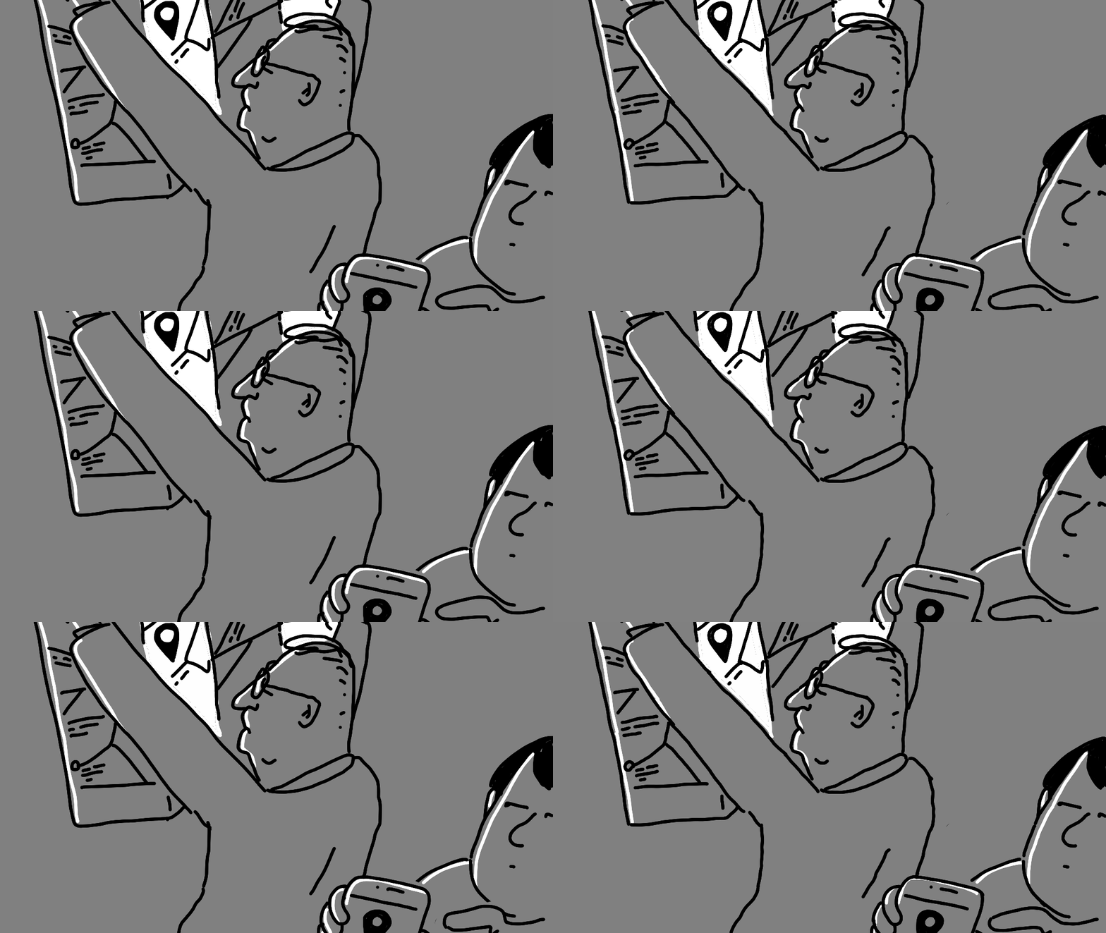
A paper map is just a paper map.
But put it next to a smartphone with Google Maps…
Suddenly, the paper map becomes a relic.
When we compare two things, we automatically create a hierarchy between them.
We start seeing one as old and the other as new.
One as slow and the other as fast.
One as obsolete and the other as current.
But we don’t necessarily see these relationships when we look at each object on its own.
The comparison can be very simple:
One object next to another.
Or you can create a whole story around the comparison.
But remember: The more details you add to a scene, the longer it takes to decode.
So always ask yourself:
How much time will my audience have to look at this?
And design your visual accordingly.
If you want to learn more about visual metaphors and use them to strengthen your creativity, my Visual Thinking membership is open.
Use INK2026 for the special October discount.
Even when you are drawing a simple, tangible object, try to tell a story.
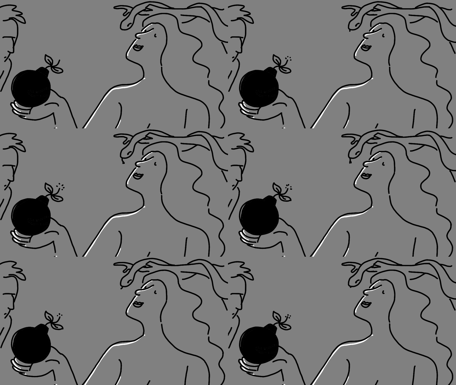
The story can be very short. Or it can be more complex. But I believe there should always be a story and something disruptive that makes us stop.
What makes a story longer or shorter?
The number of elements you add around your main concept.
I could have simply drawn an apple. Or an apple + a bomb.
But when I add other elements that give the image context, the story becomes richer.
And now, the person looking at it needs a little more time to decode what is happening.
So, the story can be short or long. But disruption always helps.
When we see something that feels out of place, our brain wants to understand why it is there.
And that small moment of confusion can make someone stop and look a little longer.
So here is my first Inktober tip:
If you want people to spend more time looking at your image, give them something to figure out.
More tips coming
